
Usability improvements for Intelligent Routing
Redesigning a route intelligence tool to be easier for users to trust the automated scheduling and make human-centered changes on their own
Role
Senior Product Designer @ ServiceTitan
Duration
3 months - Q1 2026
Launching in Q3 2026
Team
PM, Dev Lead, Stakeholders
Project Type
Enterprise operational workflow redesign -Web
Metrics
2.8/5 Confidence
Goal: 4/5 Confidence
Methods
Research - Usability Tests - Stakeholder Aligning


Product: Fill Routes is an automated route generation workflow inside FieldRoutes™️ used by dispatchers and routing managers to schedule technicians across high-volume pest control and home service operations.
Problem: The platform generated optimized technician routes automatically, but adoption remained low because users lacked confidence in the system’s recommendations. Dispatchers frequently rebuilt routes manually due to poor visibility into stop constraints, technician fit, scheduling logic, and operational tradeoffs.
What I did: I led the redesign of the route review experience, focusing on operational clarity, automation trust, and reducing the cognitive overhead required to validate and adjust generated schedules.
The goal was simple:
Get the right technician to the right customer at the right time while minimizing drive time and maximizing revenue.
The reality was much more complicated.


Design Decision #1
Make route ownership immediately obvious
Before:
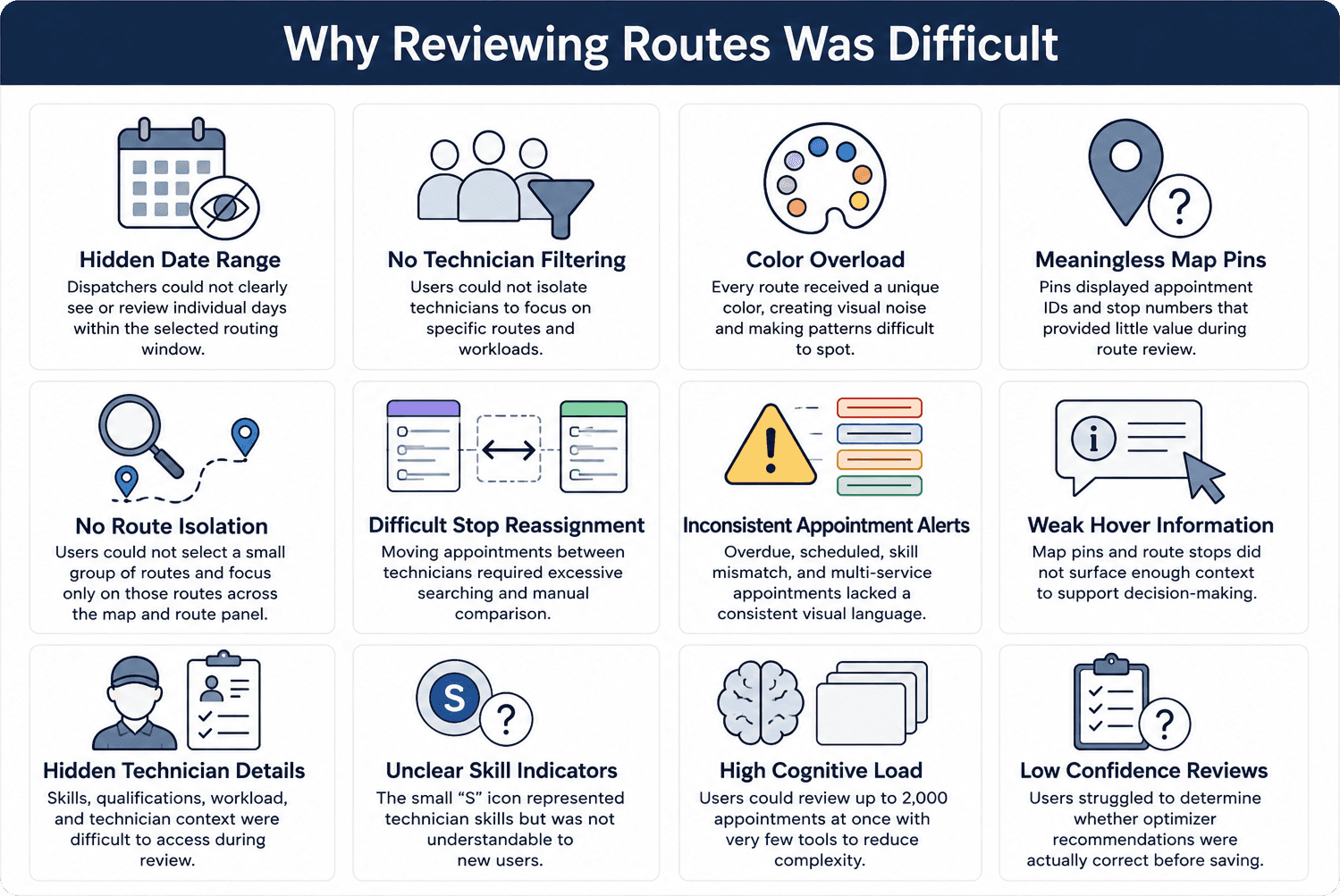
Every route for every technician was represented by a color.
Pins used the last three digits of appointment IDs.
The colors and numbers carried little meaning for dispatchers.


After:
Each technician received a single color which was used consistently across: route cards, map pins, hover states, route details
The route became visually connected across the entire experience.
Users could immediately identify:
Who owned a route
Which appointments belonged together
Which technician they were evaluating without needing to decode the interface


Design Decision #2
Redesign route cards for faster validation
Before
Route cards contained information dispatchers didn't need, like system-generated appointment IDs, while hiding information they did need.
Users had difficulty:
Identifying route revenue and workload
Understanding which day a route belonged to
Connecting route stops to map pins
Quickly scanning and comparing routes

After
Added route revenue and hours
Moved the route date into the card
Simplified stop information hierarchy
Introduced technician color-coding across cards and map pins
Strengthened the connection between route lists and map views
Impact
Dispatchers could understand route ownership, value, timing, and map relationships at a glance, reducing the effort required to review and compare routes.
Design Decision #3
Introduce Route Isolation
Before
Dispatchers reviewed routes in a crowded map containing every technician, appointment, and route.
While technician and date filters existed, users still had to mentally filter through unrelated information when validating routes. Comparing routes or investigating a specific technician often meant scanning through visual clutter.
After
I introduced route isolation as a new interaction model.
Key improvements:
Kept technician and date filters visible and accessible
Allowed users to select one or multiple route cards
Highlighted selected routes directly on the map
Added an isolation mode that removed unrelated routes from both the map and route panel
Impact
Users could focus on only the routes they were evaluating, making route validation faster and reducing the cognitive effort required to compare technicians, territories, and schedules.


Research & Discovery
I conducted 7 moderated usability testing and operational workflow analysis with Dispatchers, Routing Managers, and Field Operations teams as well as our internal Customer Relationship Managers
We observed users managing:
-technician skill matching
-geographic routing
-service windows
-recurring appointments
-day-of schedule disruptions
-territory balancing
-technician capacity constraints
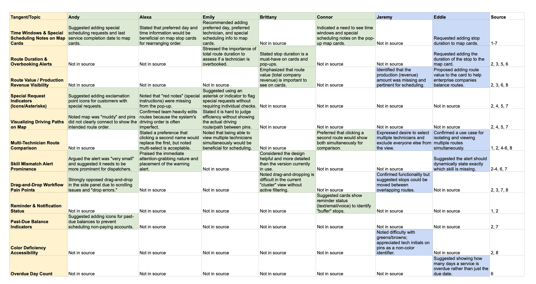
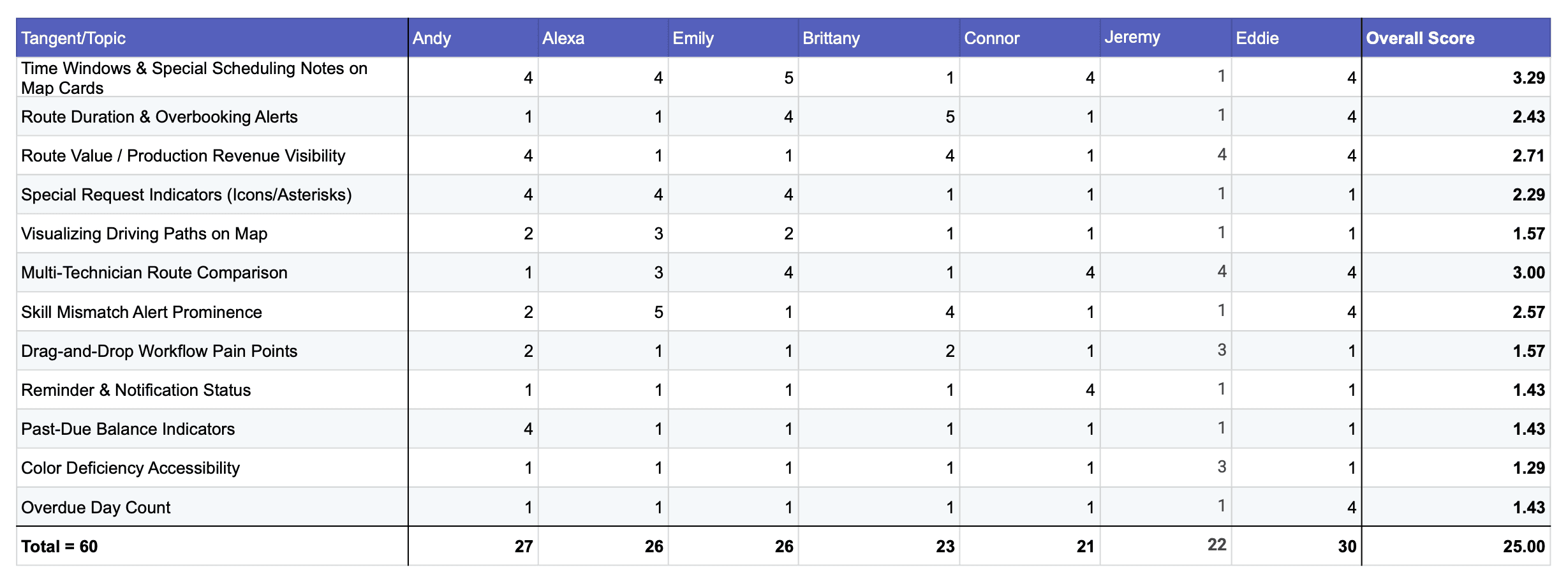
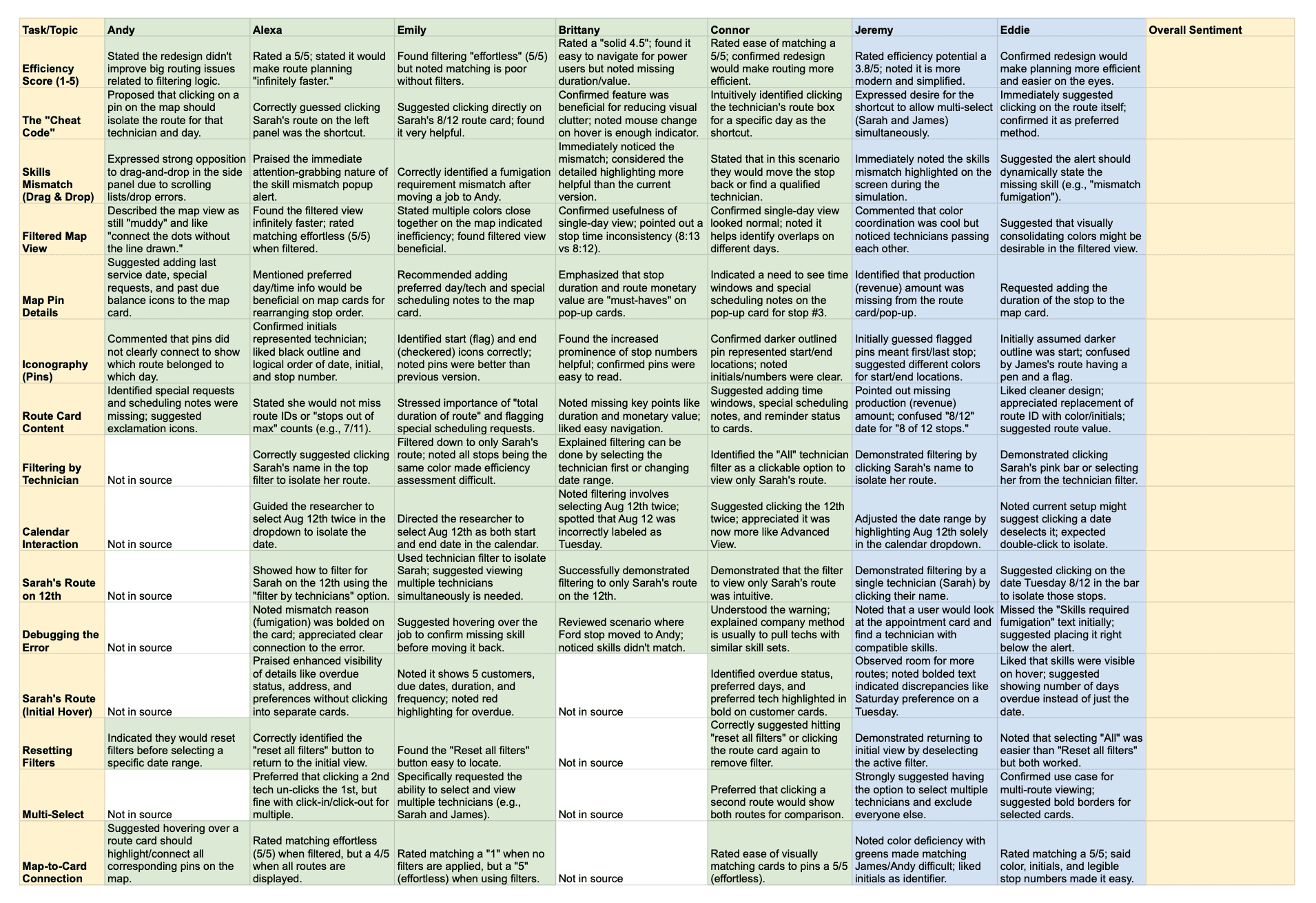
A major insight was that users did not necessarily distrust the routing algorithm itself. They distrusted their ability to quickly verify whether the system had made the correct operational decisions.
The issue was not automation quality alone. It was visibility and explainability.
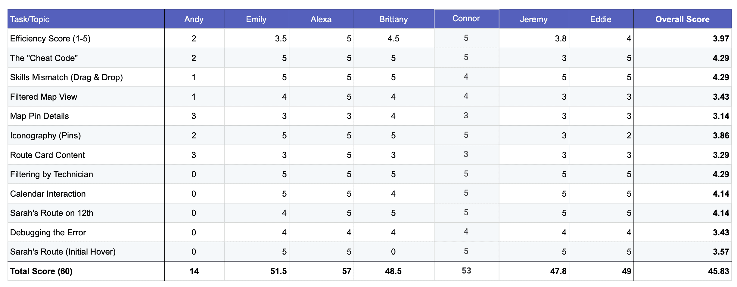
Key Insights
1. Route validation was too fragmented
Users constantly jumped between the map, side panels, and appointment detail screens.
2. Operational context was buried
Critical information like service type, constraints, technician fit, and scheduling conflicts required multiple clicks to uncover.
3. Dispatchers relied on mental models
Many users manually reconstructed route logic in their heads because the system did not clearly communicate scheduling rationale.
4. Automation trust depended on speed
If users could not validate a route quickly, they defaulted to rebuilding it manually.
Design Principles
We established several principles to guide the redesign:
Surface operational context immediately
Reduce navigation overhead
Improve map-to-route relationship clarity
Support rapid scanning under time pressure
Design for human oversight of automation
Preserve flexibility for manual intervention